Or at least it will be, soon. On the 13th of next week I'll be giving an after school workshop on blogging. If you're in the Maryland or DC area and want to attend, check out the details here.
 I'll also be going to the Powering Up With Technology Conference on the 18th, where I'll be giving one presentation on blogs and podcasts and another on good PowerPoint design. Last year's Powering Up conference was the first ed-tech event where I was the guy standing up in front of everyone, and I liked it so much that this year I sent in two proposals instead of one.
Silly me, they accepted both of them.
Well, if you're reading this it's most likely that you already know about blogs and podcasts, netcasts, or whatever we're calling them these days, but do you know how to make a great PowerPoint presentation? If you do, then .. um, well, I don't have much to offer you. Go listen to the podcasts from the K12 Online conference instead - there's some good stuff there.
If you WOULD like to know the difference between a good PowerPoint and a confusing one, keep listening.
 First of all, the term "PowerPoint" is a bit of a misnomer. We often use it to refer to any computer program that helps us give a presentation by throwing text and multimedia up on a large screen. It's sort of like how some New Jersey residents still call every brand of pork roll "Taylor Ham," and how some people refer to every cola as "Coke." Microsoft Office's PowerPoint is the most popular of these programs, but you could just as easily use OpenOffice, Apple's Keynote, or any one of a number of web based alternatives.
Ok, let's get down to business - the biggest mistake I see people make when creating a PowerPoint is that they confuse it with Microsoft Word. Word is for writing lengthy reports, and if you shrink the font size down to 9 point font then those of us with weak eyes can hold the paper closer or use a magnifying lens of some kind.
But PowerPoint is meant to be shown to a large room full of people. If you fill a single slide with so much text that it has to be reduced to even a 12 point font to make it all fit, the people in the back won't see anything except maybe a texture on the screen.
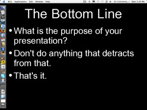
 It sounds cliché, but less really is more in this case. I used to tell my students that they needed to assume their slide was a billboard alongside a highway. How much information could they put on that billboard without causing an accident? They could always add another slide if they wanted to include more information, after all.
Later I heard of something called the 6x6x6 rule, which is not as evil as it sounds. Essentially, it means that your slide should have no more than six lines of text, no more than 6 words on each line, and the average viewer should be able to understand the main points within 6 seconds. That doesn't leave a lot of space for stuff, but really your slides should be reinforcing what you're doing up there, not the other way around.
Some of the best presentations I've ever seen consisted of less than 5 words per slide, and in many cases no words at all. Why were they the best? Because they didn't take the emphasis away from the presenter.
And there you go! You're now on your way to being a better presenter, whether it's to your class or your colleagues. There's more to it than that of course, but I have to save some for later, don't I?
No comments:
Post a Comment